Lesson 4: Create the user interface for the calculator
Start to build the calculator by using EGL wizards and
then the Rich UI editor.
About this task
You can add widgets to a web page by dragging content
to the Design surface of the Rich UI editor. The drag-and-drop and
subsequent interaction with the editor updates the source code for
the Rich UI handler that you are developing.
Two sources of
drag-and-drop content are available:
A palette of widget types
The EGL Data view, which provides data-type definitions such as
EGL Record parts. You first drag content from this view and then choose
from among the widget types that can display the type of data you
selected.
By default, the widget palette is at the right of the
editor, and the Data view is at the lower left of the workbench.
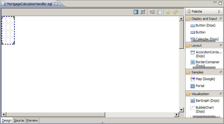
Create a Rich UI handler
Procedure
In the MortgageUIProject project,
select the EGLSource folder and click the New
Rich UI Handler button on the menu bar.
In the New Rich UI Handler part window,
enter the following information:
In the Package field, enter the
following name:
handlers
In the EGL source file name field,
enter the following name:
MortgageCalculatorHandler
Click Finish.
The new Handler opens in Design view in the Rich UI editor.
EGL creates the handlers package for you in
the EGLSource folder.
Construct the user interface
About this task
To construct the UI for the calculator:
Procedure
Create a record variable.
The EGL Data view, which is located by default in the
lower-left corner of the workbench, lists all primitive and record
variables for the handler that is currently open in the editor. Right-click
the empty space below the entry for the MortgageCalculatorHandler handler.
Click New > EGL Variable.
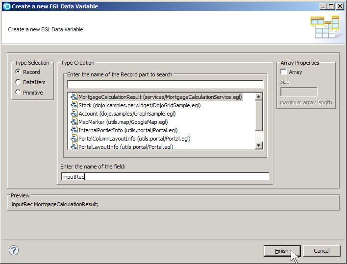
In the Create a new EGL Data Variable wizard,
request a new record variable based on the MortgageCalculationResult
Record part:
Make sure Type Selection is set to Record.
Select the MortgageCalculationResult record. This should be the
first type in the list.
In the Array Properties section, leave Array cleared.
In the Enter the name of the field field,
enter the following text:
inputRec
Click Finish.
This
process creates the following record declaration in the source code
for the handler:
inputRec MortgageCalculationResult;
The
process also shows the new record variable in the EGL Data view so
that you can drag the variable onto the editor.
EGL automatically created a GridLayout widget for you as
your initial UI. By default, this widget has four rows and three columns.
You can use different mechanisms to vary the number of rows and columns,
as demonstrated here:
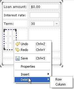
Right-click the GridLayout widget to highlight a cell.
Click Delete > Row
Again, right-click the GridLayout widget to highlight
a cell.
Click Delete > Column
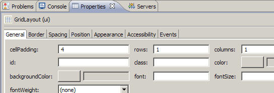
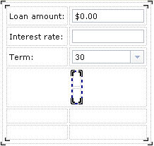
Now go to the Properties view, which by default is one
of the tabbed pages below the editor pane.
On the General page, set the rows property
to 1 and the columns property
to 1.
The modified GridLayout widget remains the initial UI for the
web page, but now has a single cell into which you will add other
content.
Click the inputRec variable in the
EGL Data view, and drag that variable from the EGL Data view to the
one cell of the GridLayout widget in the editor.
EGL displays the Configure data widgets page
of the Insert Data wizard. Use this page to configure
the widgets that EGL creates based on the fields in the record you
dragged onto the editor.
On the Configure data widgets page,
make the following changes:
In the Create Widgets for section,
click Editable data. This option determines
the default widgets that EGL displays in the wizard, none of which
have the read-only restriction.
In the Widget Type column for the loanAmount field,
click the current value in the Widget Type column, click the down
arrow, and select DojoCurrencyTextBox.
This widget provides formatting and validation for money amounts.
Leave the default DojoTextField widget
for the interestRate widget.
In the Widget Type column for the term field,
click the current value in the Widget Type column, click the down
arrow, and select DojoComboBox.
Clear the check box for the monthlyPayment and interest fields.
You will add a widget for the monthly payment field later; the
interest field is not part of this user interface.
Change the values in the Label column as follows, including
the colons:
Change "loanAmount" to "Loan amount:"
Change "interestRate" to "Interest rate:"
Change "term" to "Term:"
You just customized the prompts for each of the first data-entry
fields on the form being built.
Ensure that Add support for formatting and
validation is selected. This option adds a label and controller
for each widget, along with a form manager and related functions that
apply to all the content in the new grid layout. Do not select Use
error label to support error message. This option provides
an error label for any controller-specific error message, but this
tutorial uses other mechanisms to indicate that an error has occurred.
View the following image. When your page is essentially
the same, click Finish.
The Design view is displayed, including a new, inner
grid layout that is within the original grid layout and that contains
the new content.
To save your work, press Ctrl+S.
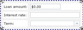
Adjust the size of the second and third input fields for
a more uniform appearance:
Highlight the input field for the interest rate.
The dotted line should enclose only that field.
In the Properties view, on the Position page, enter
the following value for the width property:
100
This value is the same as the default
width for the DojoCurrencyTextBox widget that you used for the loan
amount.
Repeat steps a and b for the Term field.
Click the Display surface to see the change.
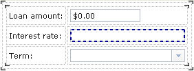
Set the valid values and the default value for the Dojo
combo box:
With the Term field highlighted,
click the General page of the Properties view.
Next to the values property,
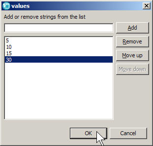
click the ellipsis (...) to display the values window.
Type the following number in the Add or remove
strings from the list field:
5
Click Add.
Type each of the following numbers, clicking Add after
each addition:
10
15
30
The values window should look like
this image:
Click OK.
To ensure that the initial display of the combo box includes
the value 30, do as follows:
Click the Source tab of the Rich
UI editor.
Set a default value for the term. Go to the line where
the inputRec record is declared and add
a set-values block to the declaration, as shown here:
inputRec MortgageCalculationResult {term = 30};
You
are embedding the default value in the declaration, as is easiest.
However, you could have updated the start() function
as follows, with the same effect:
function start()
   inputRec.term = 30;
end
While you are looking at the source code, review the following
controller declaration, which relates the inputRec.term variable
with the Dojo combo box:
The controller declaration ensures that the value you
assigned to the inputRec.term variable will be used
to initialize the combo box.
To save your work, press Ctrl+S.
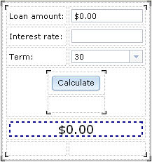
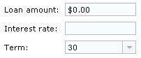
Click the Rich UI editor Preview tab.
The web page shows the runtime display and should look
like this image:
If you need to refresh the display, click the rightmost
icon on the Rich UI toolbar, which is on the upper right of the Preview
page and is shown here:
Add new content to the inner GridLayout widget, which holds
the record detail:
Click the Design tab of the Rich
UI editor.
Right-click the inner GridLayout widget, which is named inputRec_ui.
That name is displayed at the top of the Properties view.
On the General page of the Properties view, change the rows property
to the following value:
6
After you click the Design surface, the new rows are displayed
underneath the Term row.
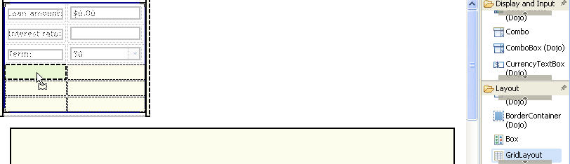
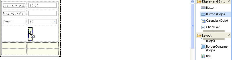
Add a second inner GridLayout widget to hold a submit button.
From the Layout drawer of the
palette, drag a GridLayout widget to the first cell in the first blank
row.
You will use the GridLayout widget
to position the submit button and an animated processing image. Give
the widget the following name:
buttonLayout
Right-click the new widget to display the menu shown
here.
Select Delete and then click Row.
The General page of the Properties view now indicates that the
grid layout has 2 rows.
Use either the Properties view or the menu that you
just used to modify buttonLayout to have one column.
If you make a mistake and want to revert to an earlier display,
press Ctrl+Z.
When buttonLayout is active, go to
the Layout page of the Properties view. Do as follows so that the
layout is centered in an otherwise blank row:
Change the horizontalAlignment property
to CENTER.
Change the horizontalSpan property to 2.
To save your work, press Ctrl+S.
Create a submit button and bind it to a stub function:
From the Display and Input drawer
of the palette, drag a Dojo Button onto the upper cell of buttonLayout.
Give the button the following name:
calculationButton
On the General page of the Properties view, change the text property
to the following label:
Calculate
Next,
you must bind the button to a function that was created for you when
you dragged the inputRec variable onto the editor.
On the Events tab, select the
row with the onClick event. Click the blank space in the Function
column to display an arrow button. Click the arrow button and select inputRec_form_Submit.
You will complete the code for this function in the next lesson.
Note
the plus sign in the last column of the row. You could have clicked
this button to create a new function to bind to the Calculate button.
The workbench would have brought you to the Source view and automatically
created a stub function, which is a function that has
no code but is ready for your input.
Add an animated image that indicates that a mortgage calculation
is in process.
From the Display and Input drawer
of the palette, drag an Image widget to the empty cell below the Calculate button.
In the New Variable window, give
the image the following name:
processImage
In the Properties view, on the General page, assign
a source for the image in the src field:
tools/spinner.gif
The image is located
in the com.ibm.egl.rui.dojo.samples/WebContent folder.
The development environment treats the WebContent folders
of all of the projects in your workspace as a single virtual folder.
Also in the Properties view, on the Appearance page,
clear the visible check box.
The
image remains hidden until the Calculate button
is clicked.
Also in the Properties view, on the Layout page, set
the horizontalAlignment property to CENTER.
To save your work, press Ctrl+S.
Add a widget to display the results of the calculation.
Drag a TextLabel widget from the Display
and Input drawer of the palette to the first cell of the
fifth row, which is below the new graphic. Assign the widget the following
name:
paymentLabel
You use a label
widget here because the user does not change this field. The application
calculates and updates the contents.
In the Properties view, on the General page, enter the
following value for the text property (including
the dollar sign):
$0.00
On the same page, set the fontSize property
to 18.
Also in the Properties view, on the Layout page, set
the following properties:
Set horizontalAlignment to CENTER.
Set horizontalSpan to 2.
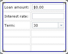
When you click the Design surface, the web page now looks like
this image:
Add an error field for general errors, such as problems
connecting to the service.
Drag a TextLabel widget from the Display
and Input drawer of the palette to the first cell of the
last empty row and assign the following name:
errorLabel
Change the following properties for the TextLabel widget:
On the General page, delete the default value of the text property
that reads "TextLabel".
Also on the General page, click the blank button next to the color property
field, and then click Name format and scroll
down the list and select Red. Click OK.
This sets the font color for any messages displayed in the label.
On the Position page, set the width property
to 250.
On the Layout page, change the horizontalSpan property
to 2.
Click anywhere in the Design area and press Ctrl+S to
save the handler.
Results
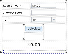
The completed interface should look like the following image:To review the source code, click the Source tab
at the bottom of the editor pane. The code should match the file contents
in Finished code for MortgageCalculatorHandler.egl after Lesson 4.
Lesson checkpoint
About this task
You learned how to perform the following tasks:
Create a Rich UI Handler.
Create a variable in the EGL Data view.
Update a user interface by dragging a record variable onto the
Rich UI editor.
Use the EGL Rich UI editor to change an interface.
Use the Properties view to format the interface.
In the next lesson, you add code to support the interface
that you just created.
 This process creates the following record declaration in the source code for the handler:
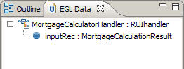
 EGL displays the Configure data widgets page of the Insert Data wizard. Use this page to configure the widgets that EGL creates based on the fields in the record you dragged onto the editor.
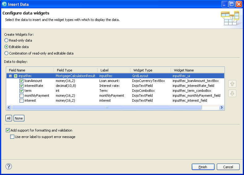
 If you need to refresh the display, click the rightmost icon on the Rich UI toolbar, which is on the upper right of the Preview page and is shown here:
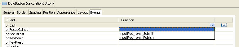 Note the plus sign in the last column of the row. You could have clicked this button to create a new function to bind to the Calculate button. The workbench would have brought you to the Source view and automatically created a stub function, which is a function that has no code but is ready for your input.