This example shows various ways to customize a HATS Dojo Combo
box widget.
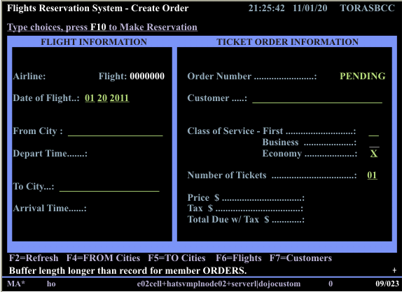
Start by creating a Combo box widget, for example, for the From
City input field on the following host screen for the Flights
Reservation System application.
Figure 1. Host screen for the Flights Reservation System
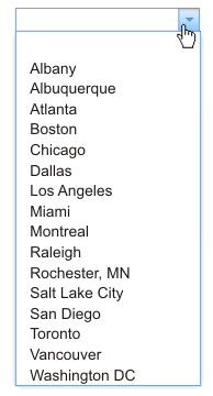
When creating the Combo box widget use the Fill
from string setting to specify the List
items to fill the drop-down list. In this example, use
the following string of city names:
Albany;Albuquerque;Atlanta;Boston;Chicago;Dallas;Los Angeles;Miami;
Montreal;Raleigh;Rochester, MN;Salt Lake City;San Diego;Toronto;Vancouver;Washington DC
After
you create the Input field component rendered with the Combo box widget,
the widget appears on the transformation .jsp file as shown below:
Figure 2. Dojo Combo box widget with list
of cities
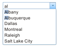
When you preview or run this example, type the letters, al,
into the Combo box. Notice that all of the cities that contain the
letters, al, are displayed in the drop-down list.
Figure 3. Dojo Combo box widget with filtered
list of cities
To customize the Combo box widget so that only cities that start
with the typed letters are display in the drop-down list, edit
the transformation .jsp file and perform the following steps:
Locate the <HATS:Component> tag in the transformation .jsp
file. Below is the source code that is created for this example.
Select the <HATS:Component> tag, right-click, and select HATS Tools > Transform for Dojo Editing.
This transforms the <HATS:Component> tag to a <HATS:Render>
tag.
Referring to the Dojo API, for example, at https://dojotoolkit.org/api/?qs=1.5/dijit/form/ComboBox,
you see that the queryExpr property controls how to match entries in the
drop-drop list. The expression, ${0}*, can be used to display only list
entries that start with the characters that the user types. Within the <HATS:Render>
tag, notice that the widget variable is named, uComboBoxWidget. To customize your widget to
display only cities that start with the typed letters, following the setInputFieldFocus();
statement add the statement shown below:
Notice the backslash (\) before the queryExpr property
${0}*. This prevents the JSP translator from processing it as
Expression Language (EL) syntax.
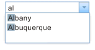
Now when you preview or run this example, and type the letters, al,
into the Combo box, notice that only cities that start with these
letters are displayed in the drop-down list.
Figure 4. Dojo Combo box using starting-with
list of cities
The Combo box widget also supports validation of user-supplied
input. Again, referring to the Dojo API documentation, you see that
the regExp property can be used to restrict the format
of user-supplied input. For example, if you want to specify
that no numbers are allowed in the user's input, following the
statement you added in the previous example, add the statement shown
below:
uComboBoxWidget.regExp = "[^0-9]*";
In addition, if you want to add a prompt message and change the
text of the default invalid value message , add the final two statements
shown below:
setInputFieldFocus();
uComboBoxWidget.queryExpr = "\${0}*";
uComboBoxWidget.regExp = "[^0-9]*";
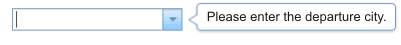
uComboBoxWidget.promptMessage = "Please enter the departure city.";
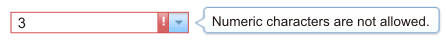
uComboBoxWidget.invalidMessage = "Numeric characters are not allowed.";
Now when you preview or run this example, notice your prompt message
is displayed when you position the cursor in the combo box.
Figure 5. Dojo Combo box prompt message
Type a value containing a number. Notice your invalid message is
displayed, and the combo box changes color and displays a warning
icon.
Figure 6. Dojo Combo box invalid
message