Rich UI GridLayout
A Rich UI grid layout has variably spaced rows and columns that embed child widgets. Each child widget has a layoutData property, and you specify the location of the widget by assigning a value to that property. Your layoutData settings also can align the widget horizontally and vertically within the position and can cause the widget to span multiple rows and columns.
- children, which holds an array of widgets, as described in Widget properties and functions.
- columns, which holds an integer value that identifies the number of columns in the layout.
- row, which holds an integer value that identifies the number of rows in the layout.
- cellPadding, which holds an integer
value that identifies the number of pixels between a child widget
and its parent; in this case, between a widget and the gridLayout
cell. A child widget might itself provide a further padding, as noted
later.If you want to have no padding between cells, add the following code to the CSS file that is referenced by the Rich UI handler:
.EglRuiGridLayout table{
    border-collapse: collapse;
}
Other supported properties and functions are described in “Widget properties and functions.”
import com.ibm.egl.rui.widgets.GridLayout;
import com.ibm.egl.rui.widgets.GridLayoutData;
import com.ibm.egl.rui.widgets.GridLayoutLib;
- The row and column position that the widget reserves for itself within the layout.
- The number of rows and columns that the widget spans.
- The widget's horizontal position (left, center, or right) within the cell that the widget reserves for itself.
- The widget's vertical alignment (top, center, or bottom) within the cell that the widget reserves for itself.
- The number of pixels that act as a padding, which is extra space around the area that the widget reserves for itself.
- The height of a layout row is equal to the height required for the tallest widget in the row, including all padding. However, a widget that spans multiple rows does not contribute to the calculation of any column height.
- The width of a layout column is the width required for the widest widget in the column, including all padding. However, a widget that spans multiple columns does not contribute to the calculation of any column width.
- Drag-and-drop widgets from the palette into specific cells of the grid layout.
- Move widgets from one cell to another.
- Drag-and-drop records from the Data view.
- Cause the automatic creation of EGL code that provides form behavior, including validation.
- “Introduction to the Rich UI editor”
- “Dragging a record onto the Design tab of the Rich UI editor”
- “Form processing with Rich UI”
Example
Consider the following user interface:
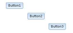
handler SingleGridlayout type RUIhandler {initialUI = [ myGridLayout ]... }

   myGridLayout GridLayout{
      rows = 4, columns = 4, cellPadding = 4,
      children = [ Button3, Button1, Button2 ]
   };
   ...
end
The myGridLayout layout includes
four rows, four columns, and a four-pixel padding around each cell.
Three children are specified, and the order in which they are listed
in the children array is not important.
However, if multiple widgets have layoutData values
that cause the widgets to occupy the same location, the first-listed
of those widgets is displayed.
For each widget, the value of the layoutData property is of type ANY. At this time, the property always takes a record of type GridLayoutData, which is described later.
myLayoutData record
is assigned to the layoutData property of
the Button1 button. Here is the record declaration:myLayoutData GridLayoutData{ row = 1, column = 2 };
The record declarations needed for the layoutData properties
of Button2 and Button3 are in the
widget declarations themselves. Here are the declarations of all three
buttons:
Button1 Button{ layoutData = myLayoutData, text = "Button1", onClick ::= respond };
Button2 Button{ layoutData = new GridLayoutData{ row = 2, column = 3 },
                text = "Button2" };
Button3 Button{ layoutData = new GridLayoutData{ row = 3, column = 4 },
                text = "Button3" };
If a record of type GridLayoutData is assigned to the layoutData property of a widget that is embedded in a grid layout, the row and column fields of the record must be set, and their values must be appropriate for the layout. However, you can assign a null to the layoutData property, in which case the embedded widget is not displayed and is not included in the width and height calculations that customize the layout as a whole.
Runtime updates to the layouts
You can update
the layout dynamically. For example, you might want the user's
click of Button1 to cause the following display:
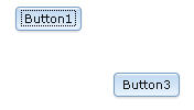
Button1:function respond(e Event in)
Button2.layoutData = null;
end After the respond function
runs, the height of the second row and the width of the second column
include only the padding specified in the grid layout definition.
The third button (Button3) moves up and to the left,
but its position relative to Button1 does not change.
Alternatively,
you might want the user's click of Button1 to
cause the following display:
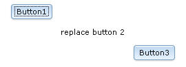
respond function:function respond(e Event in)
myLabel TextLabel {text="replace button 2"};
myLabel.layoutData = new GridLayoutData {row=2, column=3};
Button2.layoutData = null;
myGridLayout.appendChild(myLabel);
end In this case, the nulling of the layoutData property
of Button2 is necessary to replace the current content
at row 2, column 3. The new content is wider and shorter than Button2,
and the third button moves up and to the right.
In general, always null the layoutData property for a widget that you are excluding from the grid layout. When you are replacing a child widget that spans columns or rows, the nulling of that widget can avoid a runtime error.
Example with spanning and alignment
Consider the following user interface:
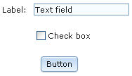
As shown in the Design tab of the Rich UI editor, the grid layout has four rows and three columns:
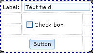
- In row 1, the label is in the first column, and the text field extends horizontally from the second to the third column.
- In row 2, the checkbox is in the second column, but extends vertically to the third row.
- In row 3, the button extends horizontally from the first to the second column and is centered in those two columns.
handler SingleGridlayout type RUIhandler {initialUI = [ myGridLayout ]... }

  myGridLayout GridLayout{
      rows = 4, columns = 3, cellPadding = 4,
      children = [ myLabel, myTextField, myCheckBox, myButton ]
   };

  myLabel TextLabel{ layoutData = new GridLayoutData{ row = 1, column=1},
                     text = "Label: " };

  myTextField TextField{ layoutData = new GridLayoutData{ row = 1, column = 2,
                         horizontalSpan = 2 }, text = "Text field"};

  myCheckBox CheckBox{ layoutData = new GridLayoutData{ row = 2, column = 2,
                       verticalSpan = 2 }, text="Check box" };

  myButton Button{ layoutData = new GridLayoutData{ row = 4, column = 1,
                       horizontalSpan = 2,
                       horizontalAlignment = GridLayoutLib.Align_Center },
                       text="Button" };
end
The next section gives details on the GridLayoutData fields.
GridLayoutData
- column
- An integer that represents the leftmost layout column where the widget resides.
- cellPadding
- An integer that represents the number of pixels that are in the top, bottom, left, and right border of the area that the widget reserves for itself.
- heightHint
- An integer that represents the number of pixels in the height
of the area that the widget reserves for itself. The value is a hint
to the browser, which might force a different value. For example,
a higher area is provided in the following cases:
- The height of the widget is greater than the value of heightHint; or
- The height of the layout grid is greater than the proposed height of the rows.
- horizontalAlignment
- The widget's horizontal position within the columns that the widget
reserves for itself. One of the following values:
- GridLayoutLib.ALIGN_LEFT
- At the left of the columns.
- GridLayoutLib.ALIGN_CENTER
- At the center of the columns.
- GridLayoutLib.ALIGN_RIGHT
- At the right of the columns.
- horizontalSpan
- The number of columns that the widget takes, including the column specified in the column field.
- row
- An integer that represents the topmost layout row where the widget resides.
- verticalAlignment
- The widget's vertical position within the rows that the widget
reserves for itself. One of the following values:
- GridLayoutLib.VALIGN_TOP
- At the top of the rows.
- GridLayoutLib.VALIGN_MIDDLE
- At the middle of the rows.
- GridLayoutLib.VALIGN_BOTTOM
- At the bottom of the rows.
- verticalSpan
- The number of rows that the widget takes, including the row specified in the row field.
- widthHint
- An integer that represents the number of pixels in the width of
the area that the widget reserves for itself. The value is a hint
to the browser, which might force a different value. For example,
a wider area is provided in the following cases:
- The width of the widget is greater than the value of widthHint; or
- The width of the layout grid is greater than the proposed width of the rows.