The Combo box widget is responsible for rendering a Dojo combo
box.
Characteristics of the Combo box widget are:
A list of value pairs consisting of a list item caption and a
corresponding list item value to be submitted to the host is displayed
in a drop-down combo box. Depending on the component being
rendered, the value pairs can be supplied by the component or manually
by you in the widget settings.
Note:
Both the caption and
value are displayed in the drop-down list.
The Combo box widget is editable, so users can type in any value
at runtime, not just what is provided in the list.
Note:
The
main difference between the Combo box and Filtering select widgets
is that the Combo box widget allows users to type in and submit values
not already in the list.
As users type into the combo box, partially matched values
from the list are displayed in a drop-down list.
The widget is customizable with many API options, which include
validation and constraint options, error messages, icons, auto-complete, and more. For
example, by default there is no client-side validation for the Dojo Combo box. To see an
example of how to add client-side validation, along with other widget customizations, see
Customizing a HATS Dojo widget.
This widget renders data supplied by the following components:
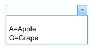
The following figure shows how a Combo box widget appears on a
transformation, using the data supplied using the Fill from string setting:
Figure 1. Dojo
Combo box widget example
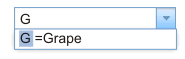
The figure below shows an example of a partially-matched
value displayed in a pop-up list. In this example, the user
typed a G into the input text box.
Figure 2. Dojo Combo
box widget filtering example
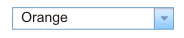
As shown in the following figure, the Combo box widget, unlike
the Filtering select widget, enables the user to type and submit values
not in the supplied list.
Figure 3. Dojo Combo box widget user supplied
input example
The following settings can be configured for this widget:
Fill from global variable
If selected, fill the drop-down list from the specified global
variable.
Global variable containing list values
Specifies the name of the indexed global variable containing
the set of values. An item for each index in the global variable will
be created in the drop-down list.
Shared
HATS local and shared global variables can have the same name.
Select this box if you want to use the shared global variable to populate
the list items. When this box is cleared, the local global variable
is used.
Global variable containing list captions
Optional. Specifies the name of the indexed global variable
containing the set of captions. The size of the global variable specified
by this value should be greater than or equal to the size specified
in the preceding setting. The indexes in this indexed global variable
should also match up with the indexes in the values global variable
(so that the actual value and caption shown to the user are in sync).
If this value is not specified, the caption for each item in the drop-down
list will be its value.
Fill from string
If selected, fill the drop-down list from the specified string.
List items
Optional. Specifies the string of items to include in the drop-down
list. Items should be separated with a semicolon (;). To have the
list item caption be different than the list item value, enter both
separated by an equal sign (=). For example, a value of Apple=A;Grape=G renders a drop-down list
with two items: A=Apple and G=Grape. Selecting the first item causes
an A to be inserted in the associated
host screen input field.
If you want both the item in the drop-down
list and the value inserted in the host screen to be the same, you
only need to enter the item. For example, Apple=A;G.
In this example, a G appears in the
drop-down list and in the host screen input field.
Auto submit on select
If selected, once a selection is made in the drop-down list,
it is submitted.