Introduction to the EGL Rich UI editor
You can use the EGL Rich UI editor to modify a Rich UI handler and to preview the handler's runtime behavior.
Here is an example of an open file in the Rich UI editor.
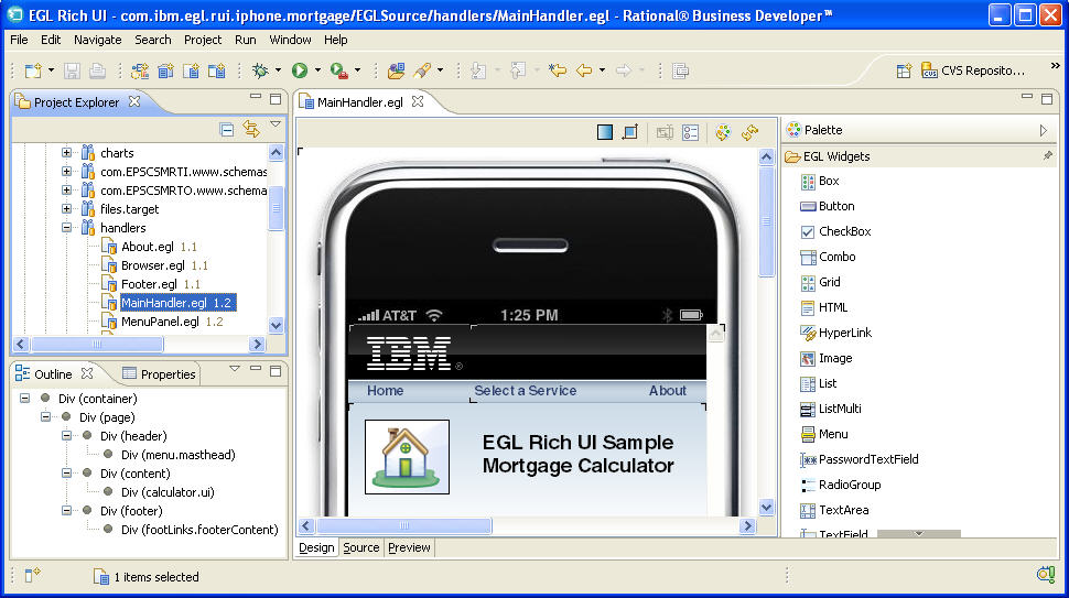
- As shown in the example, the Design surface is a rectangular area that shows the displayable content of the Rich UI handler. You can drag-and-drop widgets from the palette into the Design surface or into the Outline view and then customize those widgets in the Properties view. You can also change the placement of widgets by working in the Design surface or in the Outline view.
- The Source view provides an embedded version of the EGL editor, where you update logic and add or update widgets. The Design view and Source view are integrated: changes to the Design view are reflected in the Source view; and, if possible, changes to the Source view are reflected in the Design view.
- The Preview view is a browser, internal to the Workbench, where you can run your logic. You can easily switch to an external browser if you prefer.
Using the Design surface to create a DOM tree
When you drag a widget from the palette to the Design surface, the areas that can receive the widget are called potential drop locations, and the color of those areas is yellow by default. When you hover over a potential drop location, the area is called a selected drop location, and the color of that area is green by default. You can customize the colors in the Workbench preferences.
When
you first drag a widget to the Design surface, the entire surface
is a selected drop location, and the effect of the drop is to declare
the widget and to identify it as the first element in the Rich UI
handler's initialUI property. That property accepts
an array of widgets at development time. The array is ultimately used
to create a DOM tree, which is a runtime data structure described
in Understanding how browsers handle a web application.
Specifically, the elements in the Rich UI handler's initialUI array
become children of the document element, with the order of initialUI array
elements at development time equivalent to the order of sibling DOM
elements at run time.
- You can place the widget adjacent to the initially placed widget.
The effect on your source code is to declare the second widget and
to identify it as another element in the
initialUIarray. Your placement of the new widget is either before or after the first widget and indicates where the widget is placed in the array. - If the initially placed widget was a container, for example,
it would be a box in which you can place the second widget. The
effect on your source code is to add an element to the
childrenproperty of the container. The effect is ultimately to add a child element to the DOM tree; specifically, to add a child element to the element that represents the container.
Your subsequent work continues to build the DOM tree. You can repeatedly fulfill drag-and-drop operations, with the placement of a widget determining what array is affected and where the widget is placed in the array. The drag-and-drop operation is an alternative to writing a widget declaration and array assignment in the code itself, whether in the Source tab of the Rich UI editor or in the EGL editor.
New widget declarations are added to the source code before the declarations that were already there; that is, the order of the statements is opposite to the order of the drag-and-drop operations.
Using the Outline view to update the Design surface
- You can drag and drop a widget from the palette to a specific position in the Outline view and (therefore) to a specific position on the Design surface.
- Within the Outline view, you can do as follows:
- Drag and drop a widget to another position. (If you select a widget with descendents, the widget and its descendents can be dragged to another position.)
- Delete a widget by right-clicking the widget and clicking Delete.
- Update details about the widget by right-clicking the widget, clicking Properties, and following the procedure described in Setting widget properties and events.
Understanding the transparency options
The Design surface is composed of two layers. The bottom layer is the web browser, which displays widgets, including initial text values. The top layer is an editing overlay, including angle brackets at each corner of each widget.
The background of the top layer can have any of the following characteristics: transparent, a pattern of white and transparent dots, or (on Windows™ platforms) a white layer with a varying level of transparency. You can set those transparency options by setting a Workbench preference, as described in Setting preferences for Rich UI appearance. When you are working in the editor, you can change the transparency options that are in use for the editing session.
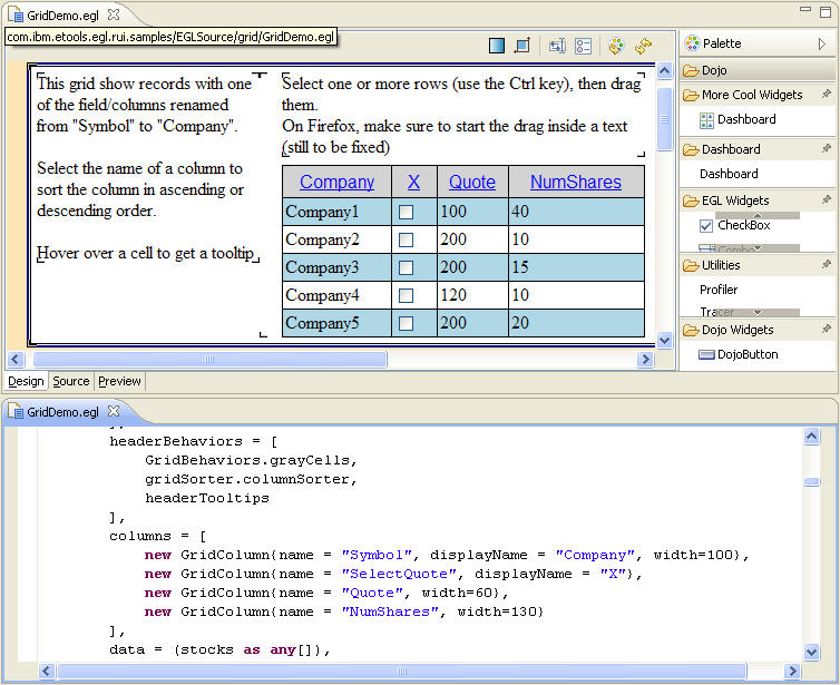
Combining the EGL Rich UI editor and the EGL editor
You can complement the features in the Rich UI editor by opening a single file in both the EGL Rich UI editor and the EGL editor. For example, the following screen shot displays the file GridDemo.egl in two ways. At the top is the Design tab of the Rich UI editor, along with a palette that lists the available Widget types. At the bottom is the EGL editor. Your work in either editor affects the same file and is reflected in the content displayed in the other editor.