When you first add a host component rendered by a HATS Dojo widget
to a transformation .jsp file, the component and widget selections
are defined within a <HATS:Component> tag. For more information
about the <HATS:Component> tag, see HATS component tag and attributes. If the
HATS default widget definitions meet you needs, then this is all that
is required.
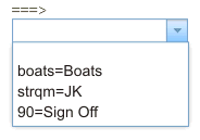
The example below shows a Command line component rendered by a
HATS default Dojo Combo box widget.
Figure 1. HATS
default Dojo Combo Box widget
In the transformation .jsp file this default component and widget
are defined within a <HATS:Component> tag as shown below.
If you want to customize a HATS Dojo widget to add function in
addition to what is provided using the defaults, you must first transform
the component and widget definitions. To do this, select the <HATS:Component>
tag, right-click, and select HATS
Tools > Transform for Dojo Editing. The Transform for Dojo Editing
wizard transforms the <HATS:Component> tag to a <HATS:Render>
tag. The example below shows the <HATS:Component> tag above after
being transformed to a <HATS:Render> tag.
<HATS:Render

<!-- Start of component settings -->
type="com.ibm.hats.transform.components.CommandLineComponent"
componentSettings=""
row="20" col="7" erow="20" ecol="21"
textReplacement="">
<!-- End of component settings -->

<!-- Start of ComboBoxWidget -->
<!-- com.ibm.hats.transform.widgets.dojo.ComboBoxWidget -->

<!-- Start of JSON data source -->

<!-- Start of JSON data for the component element -->
<script>var HATSJSON_<HATS:ElementId/> = <HATS:JSON/>;</script>
<!-- End of JSON data for the component element -->

<!-- Start of JSON widget settings -->
<script>var DOJOWidgetSettings_<HATS:ElementId/> =
{"type":"ComboBoxWidget",
"value":{"stringListItems":"Boats=boats;JK=strqm;Sign Off=90;",
         "autoSubmitOnSelect":"false","useString":"true"
}
};
<!-- End of JSON widget settings -->
</script>
<!-- End of JSON data source -->

<!-- Start of rendered widget -->
<div id="<HATS:ElementId/>">
<label for id="<HATS:ElementId/>_input"
           id="<HATS:ElementId/>_label"></label>
<input id="<HATS:ElementId/>_input"></input>
</div>
<!-- End of rendered widget -->

<!-- Start of data binding -->
<script type="text/javascript"
        src="../common/hatsdojo/hsr_comboboxwidget.js">
</script>
<script type="text/javascript">
if (HATSJSON_<HATS:ElementId/> && (HATSJSON_<HATS:ElementId/>.value){
   dojo.addOnLoad(function(){
   var uLabel = dojo.byId("<HATS:ElementId/>_label");
   var jsonData = (HATSJSON_<HATS:ElementId/>;
   var widgetSettings = DOJOWidgetSettings_<HATS:ElementId/>;
 	var jsonList = getListItemsFromJSONData(jsonData,
     getListItemsFromHATSWidgetSettings(widgetSettings));
	var storeList = new dojo.data.ItemFileReadStore(
          {data: {identifier:"value",
                  items:createUniqueItemsList(jsonList,"value")
              }
          }
);
	var uComboBoxWidget = new dijit.form.ComboBox(
         {name:getPosLengthStringFromJSONData(jsonData),
          store:storeList,searchAttr:"fullName"
         },
          "<HATS:ElementId/>_input"
);
  //load the JSON information and behavior into the Widget
		bindJSONDataToComboBox(uLabel, uComboBoxWidget,
        jsonData, widgetSettings);
		setInputFieldFocus();
	  });
	}
</script>
<!-- End of data binding -->

<!-- /com.ibm.hats.transform.widgets.dojo.ComboBoxWidget -->
<!-- End of ComboBoxWidget -->

</HATS:Render>
Notice in the example above, comments have been added to separate
different sections of the <HATS:Render> tag. These sections are
described below.